


Espoir
Redesign for Espoir
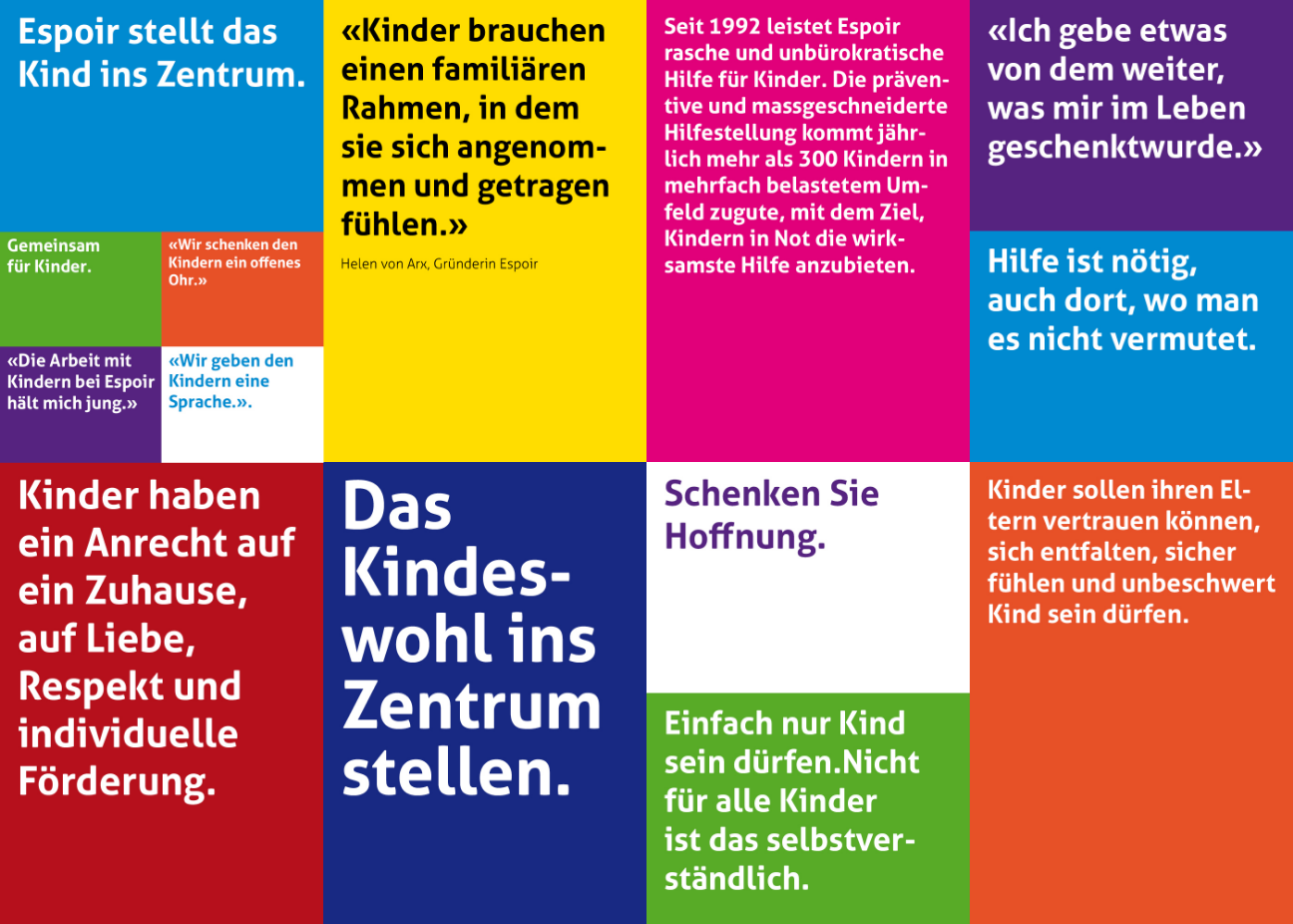
As a non-profit organization, the Espoir Association has been working for the well-being and rights of disadvantaged children since 1992. Mainly children who are victims of neglect, violence, and abuse and suffer deep mental injuries and are therefore at risk of becoming adults with severe deficits.
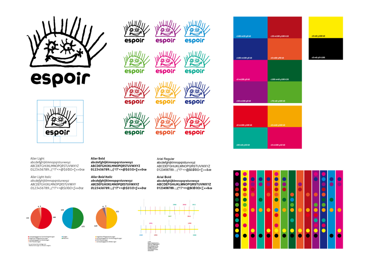
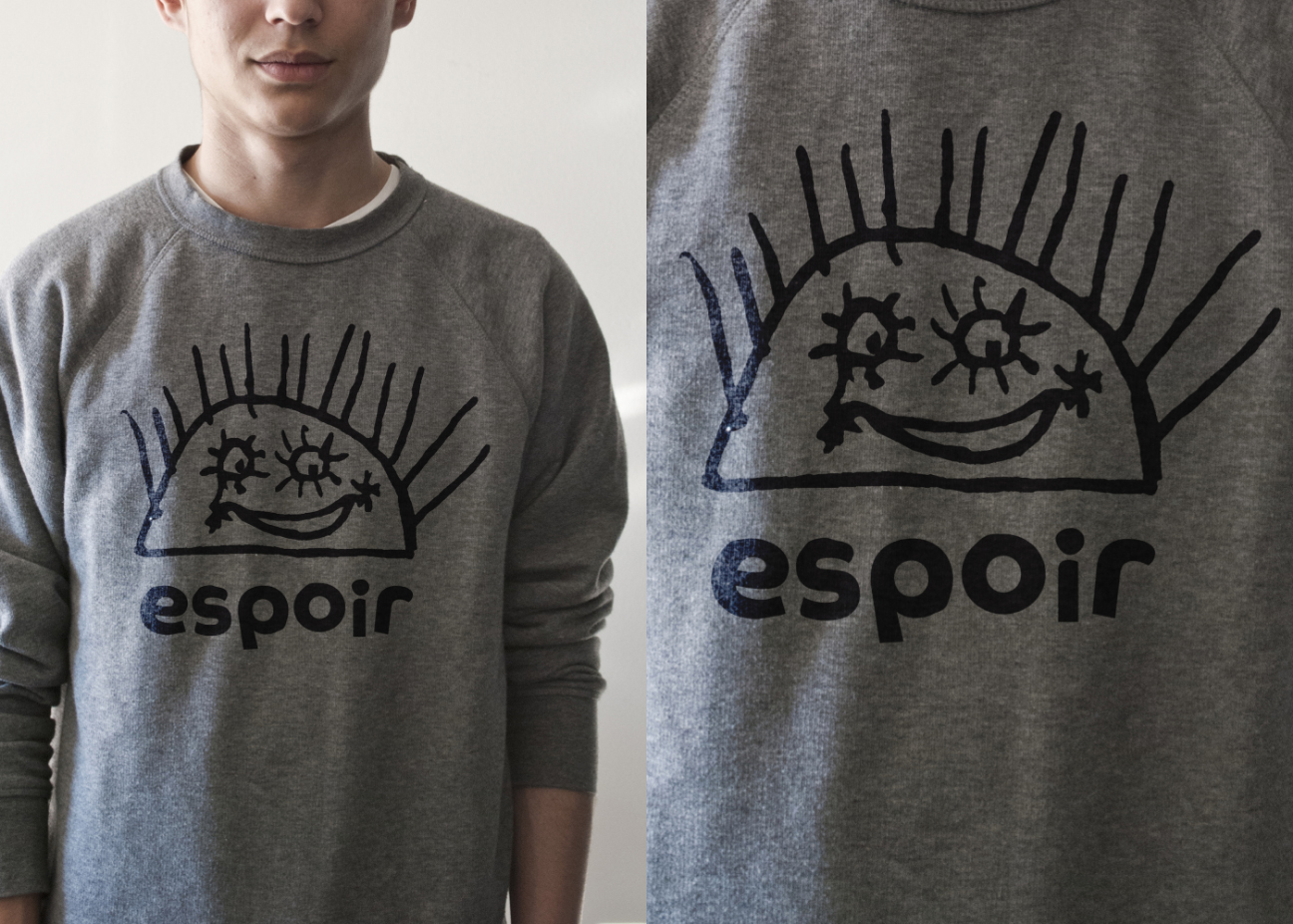
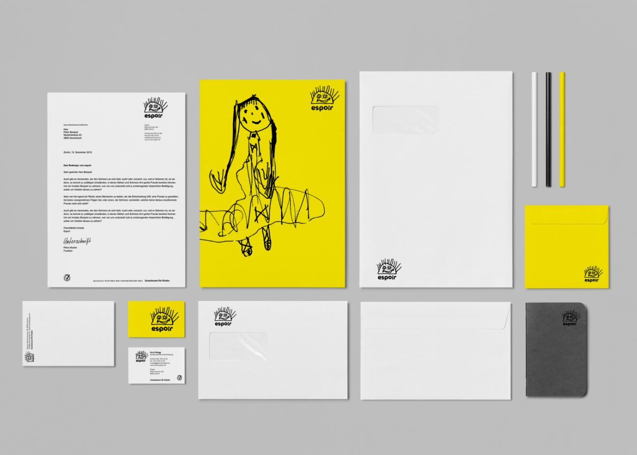
We developed a new logo that implements a happy, bright face to create a friendly, confident, and accessible visual personality. From the name “Espoir”(hope), we created an unmistakable typeface that works well with this sunny logo. This identity reflects the new direction that this non-profit organization is taking. A visual language that consists of children’s drawings and suitable imagery, yellow is a highly recognizable color and an extensive color palette. This branding project also included the development of a website.
Client Espoir / Date #2012 / Category #Branding / Branding Agency #Heads / Designers Marco Simonetti, Pablo Burkhalter / Illustrators Children in Care / Photographers Foster Parents / Consultants Ralph Hermann, Nadia Francioso
Design Direction Marco Simonetti @Heads Corporate Branding