

Curaneo
Branding for Curaneo
Curaneo was founded in 2016. The therapy offered is aimed at socially integrating working-class people with drug and alcohol problems. This new therapeutic form closes the gap between outpatient and inpatient treatment. While marginal drug and alcohol addicts have been the focus in the past, early detection and intervention have become increasingly important in recent years. Decisive for this was the realization that the prospects of success are better and the treatment costs are lower if dependent persons receive professional support at an early stage. Curaneo’s semi-residential addiction assistance program addresses these issues and closes the gap between traditional long-term care and outpatient psychosocial counseling.
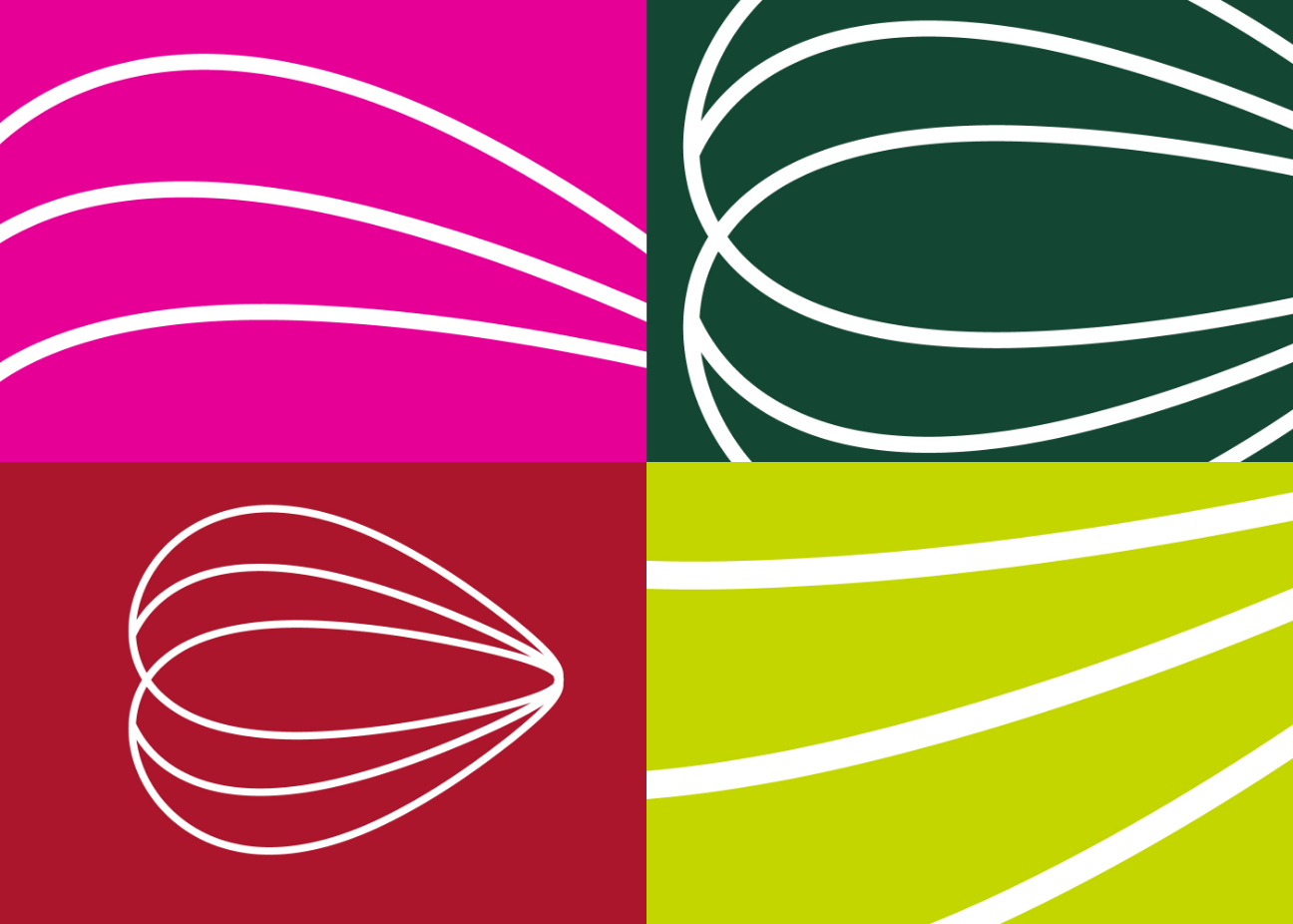
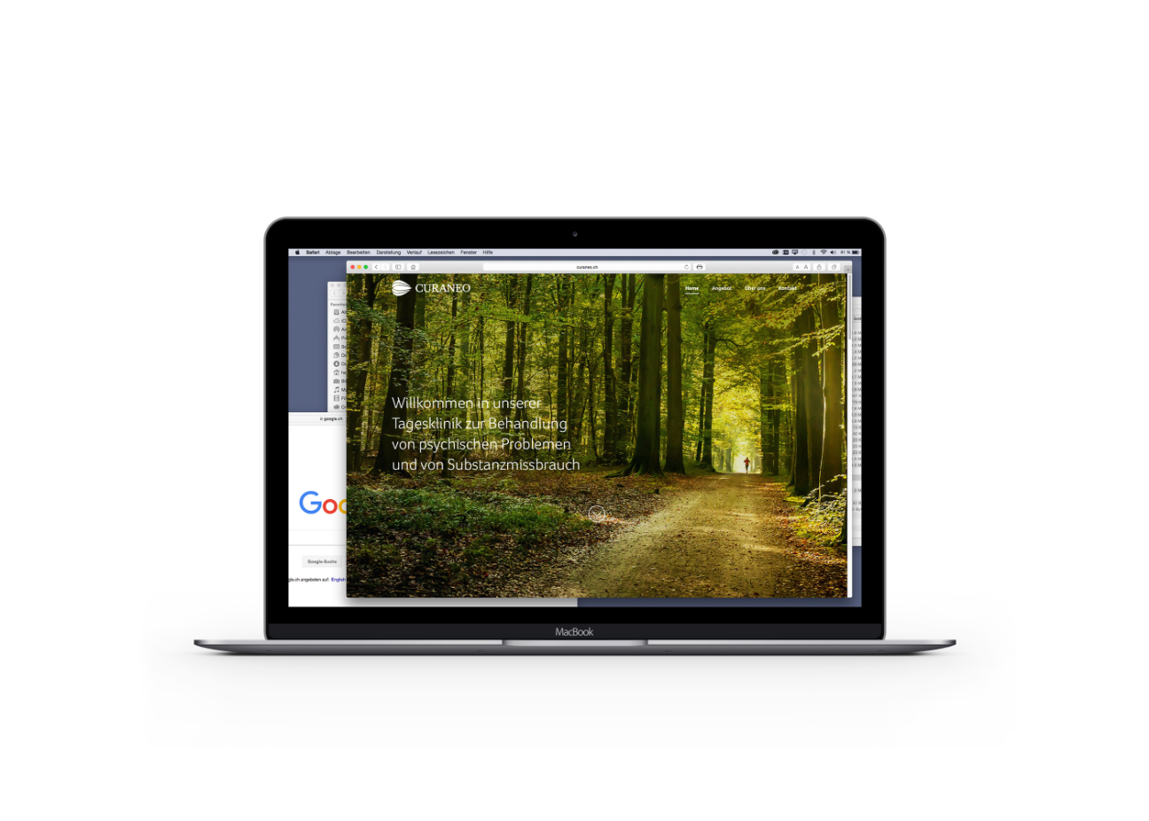
We got involved in this complex field by conducting several interviews with the clinical and medical team and collecting useful insights. We started out by finding an appropriate name for the new brand and supported the whole naming process. To develop a new and confident identity in line with Curaneo’s therapy approach, we designed a new logo with overlapping elliptical lines reflective of strong belonging, confidence, and proper expertise. For the typeface we used the Dalton Maag’s font King’s Caslon. This branding project also included the development of Curaneo’s website.
Client Curaneo / Date #2016 / Category #Branding / Branding Agency #Heads / Designers Marco Simonetti, Roman von Arx / Consultants Ralph Hermann, Ursina Grimm, Kristina Brunner
Design Direction Marco Simonetti @Heads Corporate Branding


